Sunday, October 14, 2007

Oh, Those Seventies Art Prices!


I recently ran across a stack of old Comic Buyers Guide issues that were jam-packed with original comic art ads from the early seventies, and just about had a heart attack! It was good to see some dealers from that time period are still in business today, but a majority of them have gone by the wayside. Oh, but those prices on these pieces will really make your head spin. Like the cover featured here to Avengers #73 by John Buscema was on sale for a mere $45! You might want to sit down as a give a rundown from a few ads from Richard Pryor's Gallery Of Fine Comic Art. As well as that prime piece, Richard had...Covers by Ernie Chan for Detective #461---$75, or Batman #268 for $45, or how about Justice League of America #124 staring the Justice Society for $50, not to mention Freedom Fighters #1 for $50. Would anyone like a Dick Giordano cover for Tomb of Dracula #25 for $75? Or how about a John Romita cover for Captain America #117 (sorry no logo) where Cap meets the Falcon for the grand total of $50! There's also the Ross Andru cover art to some DC war book titled, All-American Men of War, with Indian Ace Johnny Could in aerial action for...$30. Gulp! Good thing those British Planet of the Apes or Spider-Man cover were going for $15, more affordable. Whew.


How about paying some "crazy" money for comic panel pages. Lets start out with a few Craig Russell Killraven pages from Amazing Adventures #27 for $45---nice but I might spring for that Buscema cover first. Paul Gulacy had some fantastic action-packed pages from Master of Kung Fu at $35 each, or you may want to invest in a Wally Wood gem of a splash page from my favorite toy title, Captain Action #1 page 24 for $45. What would you pay today for a nice Barry Smith Conan the Barbarian page from issue #9, well they were running $150 each - WOW - finally some high dollar stuff, or is it? Ever want any Reed Crandell pages from that beautiful Gold Key favorite, Flash Gordon #1 for $35-$40 each? Maybe your money was better spent on Ross Andru's Amazing Spider-Man pages from #129 where Spidey fight this new villain named Punisher for, get this,...$30 each.


Too much to spend you say, you're on a budget and need to save for college. Richard had prices for us poor boys too, so I could spring for the John Buscema Conan #47 pages for $25 each. Ditto for Ditko's Hawk And Dove pages from issue #2, or maybe you like that weird Creeper character @$25. Can he dare go lower than that! Well, to scrape the bottom of the barrel, I guess you would have to pick up some Val Mayerick pages from Marvel's The Living Mummy or Monster of Frankenstein horror titles for $15 a piece. Or there is this guy called Russ Heath whose pages from Our Army at War with Sgt. Rock and Easy Company were selling for $15 a shot, and you can even have pages from his 1950s Battle Comics for that same price! Too bad I didn't start collecting original comic art for another fifteen years.

Friday, October 12, 2007

Keith Giffen's HEX


Jonah Hex was always one of my favorite characters as a kid. I remember the teaser DC did a few months before his arrival, "He's WILD... He's SAVAGE... He's coming in the next issue of All-Star Western #10", this "weird" outlaw as a two-faced surly bounty hunter. And I must not be the only fan who loved Jonah Hex, since I saw on eBay a few weeks ago a nice page from his first appearance went for a mere $910. Quite a hefty sum for any second or third tier character from 1971. Hex had quite a long run in All-Star Western which became Weird Western Tales before his own self-titled book. Then came that infamous jump into the 21st Century as writer Michael Fleisher tried one last ditch effort to save the character in the new sci-fi incarnation, Hex.


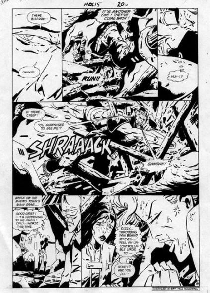
After enjoying talented figure artists like Cruz, Wildey, Ayers, and DeZuniga drawing this Western anti-hero, and some early work by Texiera for the futuristic feature, it came as quite a shock for long time DC artist Keith Giffen to draw this gunslinger turned biker gang member. Perhaps if Giffen had drawn Hex in his older “Kirby” style before his new avant garde approach, it would have been easier to swallow. I was confused, as others were, with Giffen’s sharp line, extreme exaggerated close-ups, always a big eye shot or just talking lips, strange angles, heavily inked, and other bizarre elements in his composition. Styled after the Argentine artist, Jose Munoz, Giffen once said, “All I could do was study this guy's work; poring over it and poring over it, until the point I practically became that work, and I stepped over a line.” Over a few months time where he didn’t work, Giffen just absorbed Munoz style to make it his own. Those few issues he illustrated was enough for me to quit the book, which quickly folded, even though it was very popular overseas at the time. I am glad to see Jonah Hex has been resurrected as his old crusty self in the recent series, just as wild and down right mean as ever.


So jump ahead 20 years, I ran across these issues again, gave them a second look and, surprisingly, now I've grown to enjoy Giffen! Something strange draws me in when I look at his original art. Perhaps seeing the stark black and white shapes helped me better understand what Giffen was trying to “say”, although it still helps to see the color comic pages to have a better feel for the action. Maybe now I don't mind trying to figure out the distorted angles, like the image in the middle panel of the page above from Hex #15, is that a talking chainsaw coming directly at Hex in extreme close-up? But years ago, I would have just given up on his storytelling. This moody, wild, hard-boiled approach was way ahead of it's time. I wanted that old familiar, solid figure drawing that I was used too, something, easy to "read". But with all the new approaches in comic art today, (especially Munoz’s effect on Frank Miller’s style), this page would seem tame by comparison. I never really thought this final incarnation of the character was the "real" Jonah Hex, but now I believe it worked. Once you get a taste of Giffen though, you want more of those fantastic funky pages, wild aliens, the energy bursts, all make the art more appealing as ever. And those shapes jammed together in those nine panel page layouts without any borders make it all the better too. Over the years, Giffin seems to have softened his style somewhat with The Heckler, Lobo, Trencher, and his other titles by adding more minute detail to the drawings. Even thought I enjoy his later works, I am still taken by his earlier attempts in his “Munoz” style. I've enjoyed this example, but on closer inspection, I started to wonder why the villain’s cutting hand was on the left arm in the first panel, and then on his right arm for the remainder of the page? I guess everyone is allowed some dramatic license with their work, even Keith Giffen, to make this page more powerful.


Saturday, October 6, 2007

The 3 Girls Next Door --- Alex Kotzky's Apartment 3-G


Alex Kotzky is best known for his artistic work on the long running Apartment 3-G series for Publishers Hall Syndicate. But before he created the look of one of the nations most enduring soap-opera comic strips, he did a variety of other artistic endeavors. Born September 11, 1923, in New York City he attended public school and later the Art Students League with the intention of becoming an illustrator. As an art student in the early forties, Kotzky did his first penciling assignments for the newly formed DC Comics. He also worked with legendary cartoonist Will Eisner producing backgrounds on The Spirit, before his three year commitment to serve in World War II. Upon his return from service in 1946, he drew various adventure heroes for Quality's Comics like Plastic Man, Doll Man, and Blackhawk to help better develop his craft.


In early 1951, Kotzky started out doing storyboards for the Johnstone and Cushing advertisement agency, while also working on the Ford Motor Company and Dodge auto accounts. In the mid-fifties he began freelancing, creating medical illustrations for magazines and ghosting newspaper strips like Juliet Jones, Big Ben Bolt, and Steve Canyon. He also drew for Phillip Morris the very popular Duke Handy Sunday cigarette ads at this time.


When Harold Anderson, head of the Publishers Newspaper Syndicate, heard of a new strip idea from psychiatrist and writer Nick Dallis, he quickly contacted Alex about drawing the upcoming feature. The newspaper strip Apartment 3-G developed from their well matched collaboration and debuted with a daily and Sunday format on May 8, 1961. The story detailed the adventures of three beautiful career women who shared an high-rise apartment in New York City. Lu Ann Powers was the spunky school teacher; Tommie Thompson a brainy registered nurse; and Margo Magee, a knock-out executive secretary. As well as the varied look of the ladies, usually the three have different attitudes to match there respective hair colors! To round off the 3-G trio we have their neighbor, Professor Pappagoras, a local Greek college professor who helps the girls as father figure, advisor, friend, and some time protector. This remarkably fresh strip for the day was one of the first realistic portrayals of working women in the comic pages. The intelligent storylines concentrated on the characters and their different personalities, making the strip more realistic and enjoyable to read than many of their contemporary story strips. Better writing, coupled with Kotzky's slick illustrative style and delightful portrayal of the women, made the feature a fan favorite world wide.


With the death of Nick Dallis in 1991, Kotzky began the chores of writing the strip as well. He continued with many imaginative plots and continued the spectacular graphics until his death in 1996 from kidney disease. The strip continued for a few years in a similar art style by Kotzky's son, Brian, and with a new female writer, Lisa Trusiani. As Brian Kotzky later wanted to make a career change from his artistic endeavors, veteran comic artist Frank Bolle was called to draw Apartment 3-G until its demise. Though a shadow of what it was, this classic strip still endured and was distributed to more than one hundred newspapers across the country at the time of cancellation.!


I've been fortunate to have had a nice variety of Apartments 3-Gs from its thirty-five year run with loads of beautiful girls, handsome gentlemen, buildings, autos, and those great New York City scenes. I bought a nice selection from the late sixties and the "looser penciled" seventies period which were always some of my personal favorites. I believe the strip just started to look more like fashion illustration and slick advertising artwork by the end of his run. I hope you enjoy Kotzky's beautiful detail in the panels provided!