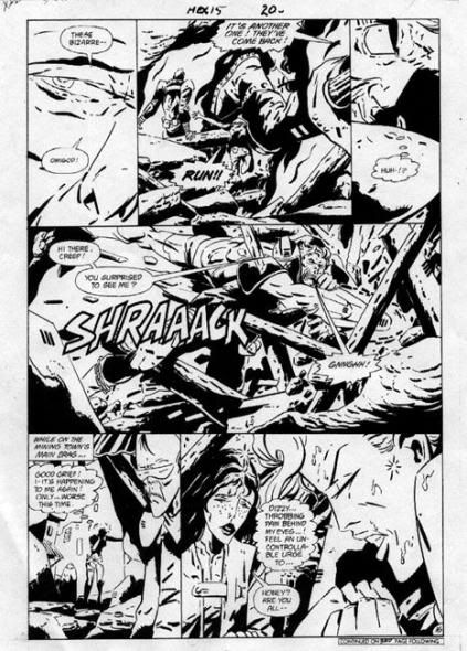
Jonah Hex was always one of my favorite characters as a kid. I remember the teaser DC did a few months before his arrival, "He's WILD... He's SAVAGE... He's coming in the next issue of All-Star Western #10", this "weird" outlaw as a two-faced surly bounty hunter. And I must not be the only fan who loved Jonah Hex, since I saw on eBay a few weeks ago a nice page from his first appearance went for a mere $910. Quite a hefty sum for any second or third tier character from 1971. Hex had quite a long run in All-Star Western which became Weird Western Tales before his own self-titled book. Then came that infamous jump into the 21st Century as writer Michael Fleisher tried one last ditch effort to save the character in the new sci-fi incarnation, Hex.

After enjoying talented figure artists like Cruz, Wildey, Ayers, and DeZuniga drawing this Western anti-hero, and some early work by Texiera for the futuristic feature, it came as quite a shock for long time DC artist Keith Giffen to draw this gunslinger turned biker gang member. Perhaps if Giffen had drawn Hex in his older “Kirby” style before his new avant garde approach, it would have been easier to swallow. I was confused, as others were, with Giffen’s sharp line, extreme exaggerated close-ups, always a big eye shot or just talking lips, strange angles, heavily inked, and other bizarre elements in his composition. Styled after the Argentine artist, Jose Munoz, Giffen once said, “All I could do was study this guy's work; poring over it and poring over it, until the point I practically became that work, and I stepped over a line.” Over a few months time where he didn’t work, Giffen just absorbed Munoz style to make it his own. Those few issues he illustrated was enough for me to quit the book, which quickly folded, even though it was very popular overseas at the time. I am glad to see Jonah Hex has been resurrected as his old crusty self in the recent series, just as wild and down right mean as ever.

So jump ahead 20 years, I ran across these issues again, gave them a second look and, surprisingly, now I've grown to enjoy Giffen! Something strange draws me in when I look at his original art. Perhaps seeing the stark black and white shapes helped me better understand what Giffen was trying to “say”, although it still helps to see the color comic pages to have a better feel for the action. Maybe now I don't mind trying to figure out the distorted angles, like the image in the middle panel of the page above from Hex #15, is that a talking chainsaw coming directly at Hex in extreme close-up? But years ago, I would have just given up on his storytelling. This moody, wild, hard-boiled approach was way ahead of it's time. I wanted that old familiar, solid figure drawing that I was used too, something, easy to "read". But with all the new approaches in comic art today, (especially Munoz’s effect on Frank Miller’s style), this page would seem tame by comparison. I never really thought this final incarnation of the character was the "real" Jonah Hex, but now I believe it worked. Once you get a taste of Giffen though, you want more of those fantastic funky pages, wild aliens, the energy bursts, all make the art more appealing as ever. And those shapes jammed together in those nine panel page layouts without any borders make it all the better too. Over the years, Giffin seems to have softened his style somewhat with The Heckler, Lobo, Trencher, and his other titles by adding more minute detail to the drawings. Even thought I enjoy his later works, I am still taken by his earlier attempts in his “Munoz” style. I've enjoyed this example, but on closer inspection, I started to wonder why the villain’s cutting hand was on the left arm in the first panel, and then on his right arm for the remainder of the page? I guess everyone is allowed some dramatic license with their work, even Keith Giffen, to make this page more powerful.

3 comments:
I really loved Giffen's style during this period. Even bought two original art pages from HEx.
Thanks for sharing
Giffen Hex art takes a bit of effort to read, but I found that a plus not a minus. He takes the story apart and constructs the visual narrative out of details, instead of talking heads.
Love finding this article in 2025, agree this style was way ahead for its time but really love revisiting them now in my 50s! Hex was a little cheesy but glad it exists!
Post a Comment